12 Medspa Website Examples, Explained: What Makes Each Screen Work
Explore 12 original medspa website examples, with annotated screens, use cases, cautions, and a 100-point score for choosing the right screen for your clinic.
Editorial method: Our team reviewed current Google Search Central, web.dev, W3C, FTC, and HHS guidance on July 31, 2026. Search-result checks were used only to confirm visual-research intent. We built all 12 screens as original HTML and CSS editorial concepts, then tested the article layout on desktop and mobile. We did not copy or rank clinic websites, test these concepts with patients, or claim conversion results. This is not clinical, legal, privacy, advertising, or accessibility advice. The featured artwork was generated for TheClinify with OpenAI ImageGen and contains no clinic, patient, or vendor assets.
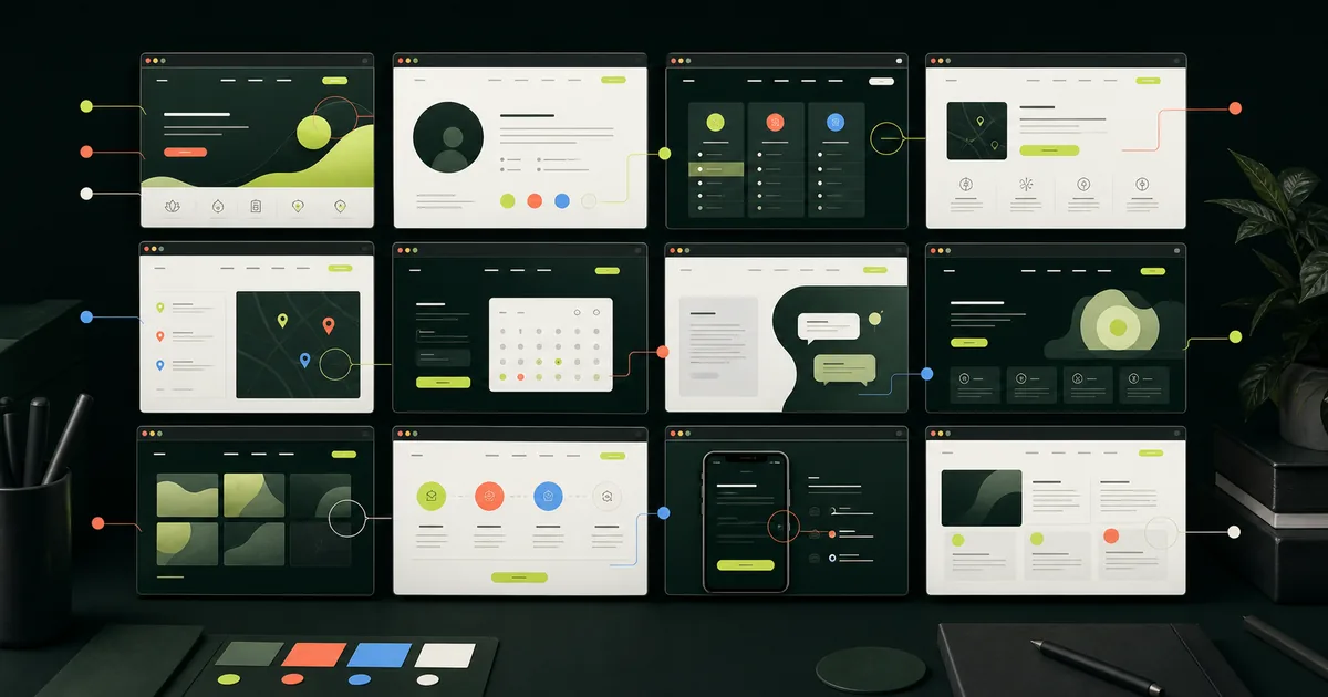
- Choose a screen for the clinic decision it must support, not for its color palette.
- These 12 medspa website examples are original concepts, not client work, copied websites, or performance rankings.
- Score every screen on intent, next step, proof, mobile use, accessibility, and speed before discussing polish.
- Keep clinical claims, patient information, and business approvals with qualified clinic owners and advisers.
What should you look for in med spa website examples?
A med spa website example is useful when it shows how a screen helps a visitor make one decision. Strong examples quickly answer four questions: what the clinic does, who the screen is for, what evidence is available, and what the visitor should do next. Color, photography, and animation come after that job is clear.
Copying a real clinic screen can also copy its weaknesses, claims, and operating assumptions. Use these original examples as problem-solving patterns, then fit the chosen pattern to your services, providers, approvals, booking process, and location.
For the full page plan, start with the medical spa website design service and the medical spa website design checklist. If a current site is being replaced, the 40-check redesign control board covers redirects, forms, claims, analytics, and launch evidence.
| Ask about the screen | Useful answer | Warning sign |
|---|---|---|
| Primary visitor | One named situation, such as a new injectable patient or a returning member. | The page says it is for everyone. |
| Page job | Compare, learn, choose a location, meet a provider, or book. | Several unrelated actions compete at once. |
| Proof | Approved provider, process, policy, pricing, review, or case evidence. | Generic claims stand in for evidence. |
| Next step | One action that matches the clinic workflow. | Every button opens the same generic form. |
How were these original concepts built and scored?
Each concept starts with a clinic situation, one page job, and one next step. None contains real patient, clinic, review, pricing, or outcome data. The annotations explain the choice, its limit, and the evidence needed for a real version.
Google's people-first content guidance asks whether a page adds original information and leaves the reader able to reach a goal. Its AI search guidance says generative search still depends on core Search systems, not special AI markup. That is why these concepts show useful page structure instead of an AI trick.
Use the 100-point Screen Fit Score as a review tool, not a conversion benchmark. A polished screen still fails when a claim lacks approval, a button opens the wrong calendar, or mobile hides the next step.
| Screen Fit category | Points | Pass question |
|---|---|---|
| Intent clarity | 25 | Can a new visitor name the page job after one screen? |
| Next-step match | 20 | Does the action match how this service is actually booked? |
| Proof quality | 20 | Is every trust element real, approved, and close to the decision? |
| Mobile task | 15 | Can the full task be completed without hunting, zooming, or re-entry? |
| Accessibility basics | 10 | Are headings, contrast, focus, labels, and controls usable? |
| Speed and stability | 10 | Does the screen reserve space and avoid heavy, blocking media? |
1. When should a homepage lead with one service?
A service-first homepage fits a focused practice or a clinic with one clear acquisition priority. It names the service category, explains the consultation path, and offers supporting routes without turning the first screen into a full treatment menu.
A broader clinic still needs visible routes to other services and provider information. The main action must match the real process, especially when a consultation comes before scheduling.
Injectables consultation
Start with the right conversation.
A focused entry point for visitors who know the service family but still need clinic guidance.- 1One page job
The first screen routes one high-intent service family.
- 2Supporting path
Provider context stays available without competing with the main action.
- 3Clinic approval
Service wording and candidacy limits need qualified review.
2. When should the provider be the first proof?
A provider-first screen suits an owner-led clinic where the consultation style and provider role explain the difference. It should state real credentials and responsibilities, then connect them to the service path. A portrait without that context is only a large image.
A short bio is not a superiority claim. Verify every name, title, license, and professional description. Then route visitors to the provider's services or consultation process.
Who guides the consultation
Meet the person behind the plan.
Provider role, approach, and service scope appear before decorative clinic language.- 1Identity first
A real provider and role replace an anonymous clinic voice.
- 2Relevant bio
Only details that help this decision belong on the screen.
- 3No implied guarantee
Credentials do not promise a patient outcome.
3. How can a treatment comparison reduce confusion?
A comparison screen helps when patients use two or three service names interchangeably. Compare only facts the clinic can support, such as consultation route, appointment type, or questions to discuss with a provider. Do not prescribe a treatment through the page.
Make uncertainty acceptable. A "not sure" path can be more accurate than naming a winner. Link every short card to a complete service page.
Compare the consultation paths
Three options. One place to start.
Parallel cards organize approved differences and keep the provider decision visible.- 1Same criteria
Every card uses the same approved comparison fields.
- 2Uncertainty path
The middle route does not force a premature choice.
- 3Deeper detail
Each option needs a complete service page behind it.
4. What makes a membership screen useful?
A membership screen works when the clinic already has a defined, approved recurring offer. It should show what is included, what is excluded, how billing works, and which services still require a separate consultation. A lifestyle photo cannot answer those questions.
Skip fake urgency and hidden conditions. If pricing varies, explain what changes it and how to get the current amount. The med spa website cost guide applies the same scope-first rule to proposals.
Recurring care, written plainly
Know what the plan covers.
A structured membership view puts scope and terms before aspirational imagery.- 1Scope before style
Included items and limits are easier to compare.
- 2One emphasis
A featured plan guides attention without false scarcity.
- 3Terms stay close
Billing and cancellation details belong near the choice.
5. How should a multi-location clinic route visitors?
A multi-location gateway should ask for location before it asks for a service when availability, providers, or booking links differ by site. The map supports orientation, while a plain list keeps the route usable for people who do not interact with maps.
Every location page needs approved facts, not swapped city names. Show its address, hours, services, contact route, and booking destination. Publish one canonical page per real site.
Choose the clinic first
Find the right local path.
Location controls come before a treatment list when operations differ by site.- 1List plus map
The route does not depend on a map interaction.
- 2Local truth
Each destination needs accurate hours, services, and booking.
- 3No doorway pages
Publish pages only for legitimate clinic locations.
6. When does direct booking belong on the page?
Direct booking fits familiar, clearly named appointment types when the clinic wants visitors to select a time without staff qualification first. Keep the service context beside the calendar so the visitor knows what is being scheduled and which location or provider applies.
A calendar does not prove the workflow. Test availability, errors, cancellation, confirmation, staff receipt, and return. Services that require screening or clinical review need a consultation route.
For a defined appointment type
Choose the service before the time.
A short sequence keeps appointment context attached to the calendar handoff.- 1Ordered steps
The calendar appears after the appointment context.
- 2Visible selection
The active date is clear without relying on color alone.
- 3Workflow boundary
Consult-first services need a different route.
7. What should a consultation-first page show?
A consultation-first page fits a higher-consideration service or program that needs staff or provider review before scheduling. The page explains the sequence, what the visitor can prepare, and where clinical decisions begin. It does not diagnose, screen, or promise eligibility.
Keep the first form narrow and explain who receives it. HHS maintains current health privacy resources, but qualified advisers must determine which duties apply to the clinic, its vendors, and its data.
A guided start, not a diagnosis
See the steps before you inquire.
The screen makes ownership and sequence clear without turning marketing copy into clinical advice.Share contact details
Clinic team follows up
Provider directs clinical decisions
- 1Sequence first
Visitors see what the inquiry can and cannot do.
- 2Minimum data
The first step avoids unnecessary sensitive details.
- 3Clinical boundary
Licensed professionals keep treatment decisions.
8. When should education lead the service page?
An education-first page fits a service that visitors may not understand from its name. Start with a plain definition and the consultation question the page can responsibly answer. Then route readers to provider, process, cost, preparation, and policy sections.
The page still needs a next step, not a button after every paragraph. Clear education can help readers finish the task while supporting the broader med spa website optimization plan.
Understand the service first
A plain answer before the pitch.
The lead definition and article cards help a visitor build context before choosing a next step.- 1Definition first
The first sentence explains the subject without hype.
- 2Related questions
Supporting articles handle genuine follow-up intent.
- 3Measured action
The CTA appears after enough context to choose it.
9. How can a results gallery avoid misleading visitors?
A results gallery needs more than a grid. It should explain what the material shows, who approved it, which service and provider context applies, and why an individual outcome may differ. Clinics also need permission and qualified review before using patient material.
The FTC's health products guidance says images, testimonials, and implied messages shape an ad's net impression. A disclosure cannot rescue an unsupported visual claim. Omit a gallery the clinic cannot support.
Approved material with limits
Context belongs beside the image.
Filters, captions, permissions, and outcome limits are part of the interface.- 1Filter by context
Service and provider details travel with each item.
- 2Permission record
Publishing requires the clinic approval process.
- 3Net impression
Words and images must not imply unsupported results.
10. How should a program page explain a longer process?
A program timeline works when the patient journey has several operational stages. It can show inquiry, consultation, onboarding, and follow-up without claiming that every patient receives the same care or outcome. Name the handoff, not a medical result.
Avoid false precision. Say when timing depends on availability, records, or provider direction. Separate online steps, staff work, and provider judgment so a marketing timeline is not mistaken for a care plan.
See the operating sequence
A longer path can still feel clear.
A visible sequence separates website steps, staff follow-up, and provider decisions.- 1Operational stages
The timeline describes handoffs, not outcomes.
- 2Flexible timing
No fixed duration is promised without clinic evidence.
- 3Named owner
Each stage should tell the visitor who responds.
11. What does a mobile-first booking handoff need?
A mobile-first handoff keeps the service name, location, selected action, and return route visible when a visitor moves to booking. The button should remain easy to activate without covering content or fighting a cookie banner, chat bubble, and browser controls.
WCAG 2.2 sets a 24 by 24 CSS pixel minimum for many pointer targets, with exceptions. It is only a floor. Test focus, zoom, labels, error recovery, and the full task on real phones.
Keep context on the phone
The next step stays in reach.
The screen preserves service context while one clear action moves to the booking tool.- 1One thumb task
The primary action stays clear without a stack of buttons.
- 2Context survives
The handoff names the service and location again.
- 3Recovery path
Errors explain how to continue without losing entries.
12. When should the blog act like a service gateway?
An editorial gateway works when the clinic has useful, reviewed education tied to real services. Organize articles around patient questions and service decisions, then link each guide to the right service page. A date-sorted blog with no topic path makes the reader do the routing.
Google's link guidance recommends crawlable links and descriptive anchor text. Each article still has to answer a distinct question. Do not publish near-duplicates to fill a grid.
Education connected to action
Find the answer, then the service.
Topic cards route readers from a question to a reviewed guide and the matching clinic page.- 1Topic clusters
Articles group around a real service decision.
- 2Descriptive links
Anchors tell readers what the destination contains.
- 3No filler posts
Each guide needs distinct intent and useful depth.
Which medspa website example fits your clinic?
Choose the concept that matches the next business decision, not the clinic's preferred design trend. A focused injector may need provider and service proof. A multi-location group may need routing first. A clinic with a confusing booking system may need the mobile handoff before it needs another homepage redesign.
Score the current screen first. Fix weak intent or routing before visual polish. If the structure works but proof is thin, gather approved provider, process, policy, pricing, or case information before polishing it.
| Clinic situation | Start with concept | Evidence to gather first |
|---|---|---|
| Focused owner-led clinic | 1. Service first and 2. Provider first | Service priority, provider role, consultation route. |
| Several similar services | 3. Comparison and 8. Education | Approved differences, page definitions, decision boundaries. |
| Recurring offer | 4. Membership | Current scope, pricing, terms, exclusions, contact owner. |
| More than one location | 5. Location gateway | Address, hours, services, providers, booking destination. |
| Simple bookable appointment | 6. Direct booking and 11. Mobile handoff | Appointment type, availability, errors, confirmations. |
| Higher-consideration program | 7. Consultation first and 10. Timeline | Data map, owners, sequence, clinical boundary. |
| Approved patient material | 9. Gallery | Permission, context, limitations, claim support. |
| Strong education library | 12. Editorial gateway | Distinct topics, reviewer, service links, update process. |
What should you test before publishing the design?
Test the complete visitor task on the production build. Check the facts, claims, links, form, booking destination, confirmation, staff receipt, keyboard path, mobile layout, and errors. A screenshot cannot prove those paths.
The search-to-appointment conversion path gives each handoff an owner, pass evidence, and failure signal so the visual review does not stop at the booking button.
For performance, web.dev defines good Core Web Vitals at the 75th percentile as LCP within 2.5 seconds, INP at 200 milliseconds or less, and CLS at 0.1 or less. Lab checks help before release, but field data requires real visits. Reserve media dimensions and test third-party booking tools instead of assuming a clean mockup will stay fast.
Structured data must match visible content. Google's structured data guidelines do not guarantee a search feature. Publish only the BlogPosting, Breadcrumb, Organization, or service data the page supports.
TheClinify's managed custom clinic website offer is $2,499 for setup plus $499 per month. That price does not make every concept appropriate for every clinic. The starting point is still the clinic's current site, approved information, operating workflow, and highest-priority patient task.
- Confirm one page intent, one canonical URL, one H1, and one primary action.
- Get qualified approval for clinical content, claims, patient material, privacy choices, and legal duties.
- Test desktop, mobile, keyboard, zoom, errors, form delivery, booking, and the return path.
- Check titles, descriptions, canonicals, internal links, image dimensions, sitemap coverage, and schema.
- Record who tested each path, when it passed, and what would block launch.
FAQ
What makes a good medspa website?
A good medspa website makes the clinic, service, proof, and next step clear. It also works on mobile, uses approved claims, keeps forms and booking paths reliable, and gives each important service a useful page.
Should a medspa copy a website example it likes?
No. Borrow the problem-solving pattern, such as provider-first proof or location-first routing, then design around the clinic's own services, approvals, booking workflow, evidence, and brand. Do not copy another clinic layout, copy, patient material, or claims.
Do medspa websites need online booking?
Not every service needs direct booking. Defined appointment types may suit a calendar, while higher-consideration services may need an inquiry or consultation first. The page should use the route the clinic can actually support.
How many pages should a medspa website have?
There is no universal page count. Start with the homepage, clinic and provider information, contact and policy pages, and useful pages for priority services and real locations. Add articles only when they answer a distinct question and support the service path.
Want to know which screen your current site needs first?
Send the public site. We will review five vitals and identify the three fixes we would put first.
Book a Clinic Pulse Check